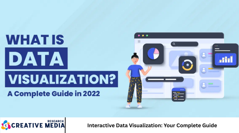
In an era dominated by vast amounts of data, the ability to understand and communicate insights effectively is more crucial than ever. This is where interactive data visualization comes into play—a dynamic and engaging way to present data that transforms raw numbers into stories and insights.
Unlike static charts and graphs, interactive data visualizations invite users to explore data, uncover patterns, and make data-driven decisions with ease. From business dashboards to public health data maps, interactive visualizations have become indispensable across industries.
This guide covers everything you need to know about interactive data visualization: its importance, key components, tools, design principles, best practices, and real-world applications. Let’s dive in.
What is Interactive Data Visualization?
Interactive data visualization refers to visual representations of data that allow user engagement and manipulation. Users can interact by filtering, zooming, hovering, clicking, or drilling down into details, making the exploration of complex datasets intuitive and personalized.
This approach enhances understanding by enabling:
- Dynamic data exploration
- Customizable views based on user needs
- Immediate feedback and insights
- Improved decision-making through better comprehension
Why Interactive Data Visualization Matters
Improves Data Comprehension
Interactivity lets users focus on relevant data points, simplifying complex information.
Enhances User Engagement
Users spend more time exploring interactive visuals, increasing retention and insight discovery.
Supports Better Decision-Making
Tailored data views enable stakeholders to make informed, timely decisions.
Facilitates Storytelling
Data becomes a narrative when users interact and uncover trends on their own.
Key Components of Interactive Data Visualization
- Visual Elements: Charts, maps, graphs, heatmaps, and infographics that display data.
- Interactivity Features: Tooltips, filters, zoom, pan, click events, and drill-downs.
- User Interface (UI): Controls and layouts that guide exploration.
- Data Backend: Data sources and engines supporting real-time or static datasets.
Popular Tools for Creating Interactive Data Visualizations
- Tableau: User-friendly with powerful drag-and-drop features.
- Power BI: Microsoft’s business analytics tool for interactive dashboards.
- D3.js: JavaScript library for custom, complex visualizations.
- Plotly: Python and JavaScript libraries for interactive charts.
- Google Data Studio: Free tool to create shareable reports.
- Qlik Sense: Self-service data analytics platform.
- Figma and Adobe XD: For designing interactive prototypes.
Designing Effective Interactive Data Visualizations
Understand Your Audience
Identify who will use the visualization and tailor complexity accordingly.
Choose the Right Chart Types
Match data types and analysis goals with appropriate visual forms (bar charts, scatter plots, maps, etc.).
Prioritize Usability
Ensure controls are intuitive and the interface guides users effortlessly.
Maintain Data Accuracy
Avoid misleading visuals; represent data truthfully.
Optimize for Performance
Large datasets require efficient loading and rendering.
Provide Clear Instructions
Guide users on how to interact and what insights to look for.
Best Practices for Interactive Data Visualization
- Simplify Complexity: Avoid clutter, focus on key insights.
- Consistent Design: Use cohesive colors, fonts, and styles.
- Accessibility: Ensure visualizations are usable for all, including screen reader support and color-blind friendly palettes.
- Mobile Responsiveness: Design for various screen sizes.
- Feedback and Animation: Use subtle animations to signal interactions and changes.
- Data Refresh: Keep data current for accuracy.
- Test with Users: Iterate based on real-world feedback.
Real-World Applications of Interactive Data Visualization
- Business Intelligence: Dashboards tracking KPIs and sales performance.
- Healthcare: Monitoring disease spread with interactive maps.
- Finance: Portfolio performance and risk analysis.
- Education: Interactive learning tools and performance dashboards.
- Public Policy: Visualizing census or election data.
- Marketing: Campaign analytics and consumer behavior insights.
Future Trends in Interactive Data Visualization
- AI-Driven Visualization: Automated insight generation and recommendations.
- AR/VR Integration: Immersive data experiences.
- Voice-Controlled Interaction: Navigating data via voice commands.
- Increased Personalization: Tailored visualizations based on user behavior.
- Greater Collaboration: Real-time multi-user data exploration.
Frequently Asked Questions
What is the difference between static and interactive data visualization?
Static visualizations are fixed images, whereas interactive ones allow user manipulation and exploration of data.
Which tools are best for beginners in interactive data visualization?
Tableau, Power BI, and Google Data Studio are user-friendly for beginners.
How can I make my interactive visualizations accessible?
Use high-contrast colors, include keyboard navigation, provide alternative text, and test with accessibility tools.
What types of data work best for interactive visualizations?
Time-series data, geographical data, hierarchical data, and large datasets benefit greatly from interactivity.
How important is storytelling in data visualization?
Storytelling helps users make sense of data, turning raw numbers into actionable insights.
Can interactive data visualizations be embedded on websites?
Yes, many tools support embedding via iframe or APIs for seamless integration.
What are common challenges in creating interactive visualizations?
Challenges include data quality, performance optimization, design complexity, and ensuring accessibility.
Conclusion
Interactive data visualization is transforming how we understand and communicate data. By combining visual appeal with user control, it enables deeper insight, engagement, and informed decision-making. Whether you’re a business leader, data analyst, or educator, mastering interactive data visualization empowers you to harness the full potential of data in 2025 and beyond.Start exploring the tools and principles outlined in this guide, and create compelling, dynamic visual stories that resonate with your audience.

